Tuesday, 21 September 2010

Re-brand (Jam & Toast)

I finally brought my head around to re-branding myself as Jam & Toast - and I'm so happy I did. I feel I will be able to be more inventive and experimental with this name than I could be with any of my other ideas. Below are the initial stages of the design process for Jam & Toast design. Because I have a growing passion for typography I decided this would be the best oppurtunity to show what I can do which is simple yet affective. I also want to play with the layout so that my final resolution can work with my business cards.

Belows examples are the initail design stages of Jam & Toast - at the time I was pleased with the progress I was making, however I felt the design was a bit flat and did not communicate my skills properly. But looking back it was a good process to try out different typefaces before I made my final decision.


As I said above - I feel these designs were too flat and would not compliment or give an impression of the work I can produce. Back to the drawing board.

Sunday, 19 September 2010

Re-brand (Mr Designmann)

So after the disaster that was Mr ReDesign I decided to use the same principle only relate it more directly to where I'm from and the location of where I may take my work too. A lot of people would think that I have been an idiot and spelt 'Man' wrong - however 'Mann' is a manx God and the double 'n' is very commonly seen on the Isle of Man.
I wanted something more organic and playful from the existing Wetpaint logo - I wanted to play with vibrant colours and space.
We were asked to produce a business card for one of our group tutorials so this seemed as good a time as any to re-brand myself while producing the design to work on a business card.
I have always wanted my business card to be different in terms of shape, scale and layout - and i feel this design is halfway there.
Once again however I am not overly impressed with Mr Designmann and feel that it does not compliment the work I can and like to produce. This was a good design process - and I will be taking with me the knowledge of business card scale, layout and the colour pallet.


Wednesday, 15 September 2010

Re-brand (Mr ReDesign)

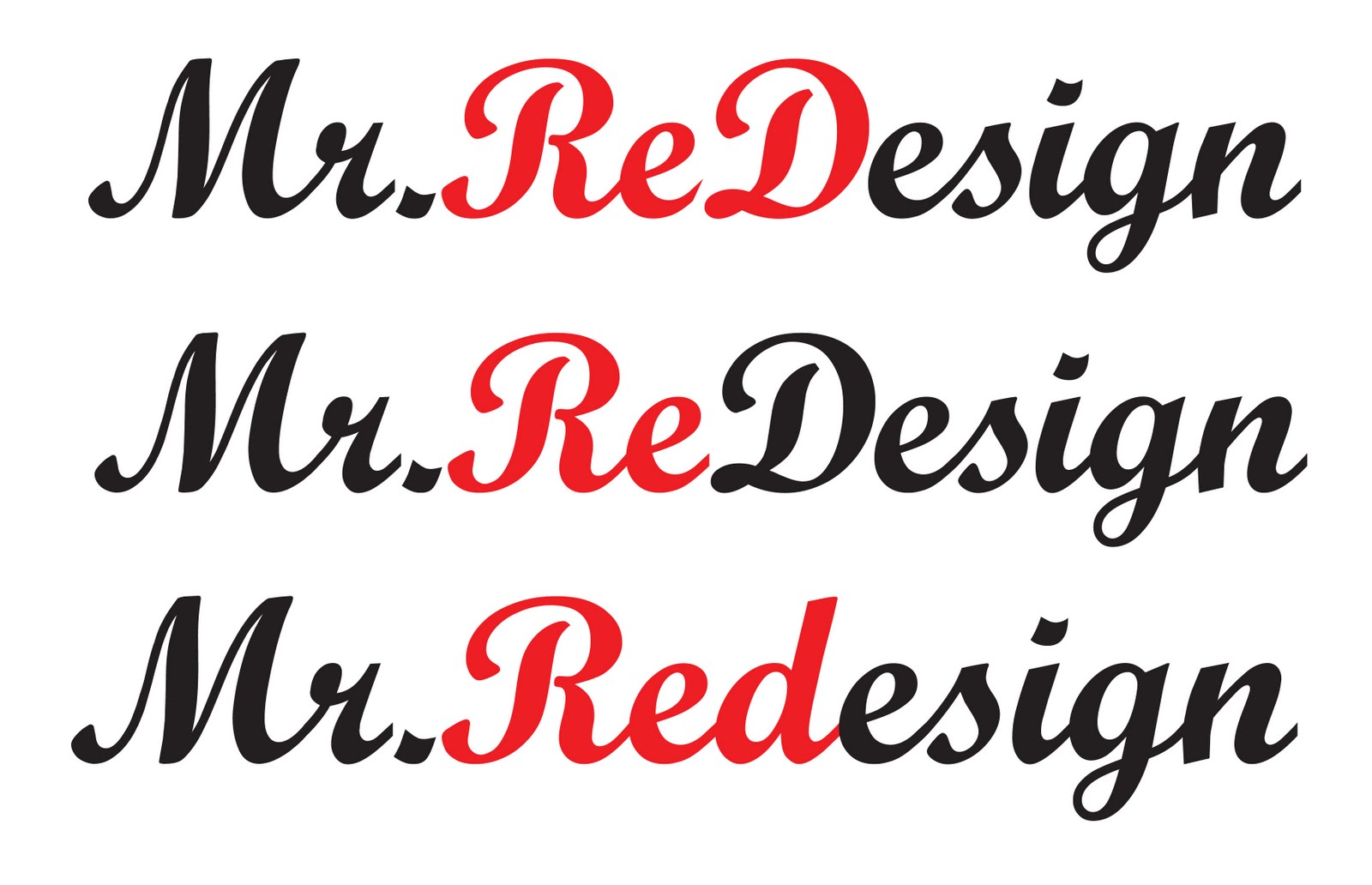
My re-branding started with 'Mr ReDesign' However I wanted to be clever with this design by including one of my nicknames 'Red" into the design. Below are some examples of where the design was heading - however I didn't feel comfortable with this design and felt the name didn't work and carry the message I wanted. Instead of reading Red Design which is what I wanted the eye to read - it just read Redesign. Which is not what I wanted at all. So it was back to the re-brand.

Monday, 13 September 2010

Typography gallery

While down in London visiting my girlfriends family I took advantage of where I was and looked into any galleries that were taking place near where I was. It just happened that I was in luck and that the Kemistry Gallery on Charlotte Street were hosting a gallery on typography.

Attending this small exhibition really did open my eyes to how far design can be taken. The work was beautiful and inspirational - it really did help me get back into the designer frame of mind that I had lost during the summer 'chill'. One piece really did catch my eye which was designed on illustrator and cut from a 6 inch thick piece of wood and a laser cutter or something similar. The finish was brillaint - and has inspired me to make a piece similar myself.


Sunday, 12 September 2010

Wetpaint

So over the last few weeks I have been re-branding Wetpaint Design. However I was struck down when I found the web address I wanted was already occupied. I also found that wetpaint was becoming a very common design name by illustrators, painters and graphic designers.

I decided now was good a time as any to re-brand myself with a new designer name:

  • Chocka Design
  • Mr Design
  • Mr Designmann
  • iamdesign
  • Jam and Toast
  • Total Design
The above are examples of several which I thought about developing. However at this stage I decided I would go with 'Mr DesignMann'

Saturday, 11 September 2010

Summer placement (website mock-ups)

I thought I would include some of the mock-ups I produced for the Isle of Man Post Office's new website. As I said in my previous post - i had several guidlines and restrictions. These included:

  • Mail tracker search box
  • Isle of Man Post Office logo
  • 3 Pods
  • The Isle of Man Government link
  • The use of Red and Blue (I was given the spot colours)


I was pleased with all of my mock-ups. I was asked to produce the site with the elderly in mind. I tried to make the site layout simple and affective. I broke down all of the links which were previousl there (around 15) to just 4. Much more managable and easy to understand and follow. I feel with the limited colour pallet I worked the layouts well and I'm pleased to say one of the above will be gettin produced by a web-designer in the next few months.

Wednesday, 8 September 2010

Summer placement

Over summer I sat a placement at the Isle of Man Beauro post office. I was put in the marketing department for a week where I experienced a range of different briefs which were all live.

My experience was good one - as I said in my presentation the first couple of briefs I undertook were 'dull' however it got me into a good frame of mind to start designing.

Over the week I was asked to produce several A0 posters which would be situated in the reception areas of the building I was working in. I was also asked to produce several which could be used on the streets of Douglas (the city) that promoted new ranges of stamps and coins which were avaliable. For this task i was asked to use photoshop - a piece of software which I am familiar with, however not used in my own work in some years.

My favorite task was to produce a mock-up for a new look website. I was given a limited colour pallet and the fonts which were to be used along with several guidlines in terms of what HAD to be seen on the site. I really enjoyed this task - even though it was limited in terms of freedom I could still be experimental with the layout and mix of colours.

All in all - I found my work experience very valuable. It was great to see how the design department worked and how briefs were managed all at once. I wish to do more work experience however this time I would like to be in a design house. I think this is the direction I wish to go in. I would like to produce work freelance however a steady job with a good income and valuable experience I feel is essential in my practice rite now.

Thanks to Dot Tilbury for giving me the placement and the rest of the staff who made me feel a part of the team on my first day.


A couple of snapshots of me at my desk researching other websites and developing some mock-ups for the new Isle of Man post office website.