
Wednesday, 11 May 2011
Wednesday, 9 March 2011
MR - Business Card
After the re-brand and as mentioned in the previous post, now that a new indetity has been designed, i am long overdue some new business cards.
Much like the actual identity, i tried to keep the business cards minimal in terms of design and information given. I did not want to clutter the design, and with keeping of the theme minimal i felt that a smaller format, which is 8.5 x 3.15 cm would be more appropriate and unique.
Things to think about:
- Colour pallet
- Print specs
- Feedback

MR - Invoice Template
As more live briefs come in, it becomes more neccasary for organisation and template forms. Another student showed me their invoice slip and said it would be quick to produce and useful for both myself and my clients.
I have not issued my first one like this just yet, so as an added extra i have kept and invoice number, to keep record of my past projects name and detials, along with a total number.
I wanted to keep the template simple in design, legiable, readable and easy to understand. Again because of becoming pretty anal about precision, the type all lines up and sits comfortably within a grid that can be further edited.

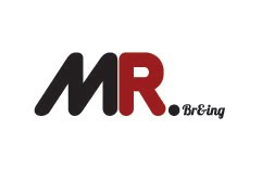
MR - Re-Brand Final Logo
Here it is, the final resolution for my re-brand. I feel this represents me as a designer perfectly: Simple, minimal, effective and direct. As i experimented with the colour pallet, i found a light but dark tone worked better than a solid bold colour.
The next stage is to place the logo across my range (stationary set) and get them printed and produced asap for future visiting professionals, studio visits and to give to potential future clients.

The next stage is to place the logo across my range (stationary set) and get them printed and produced asap for future visiting professionals, studio visits and to give to potential future clients.

MR - Re-Brand
I was getting a bit tired of my last identity. I felt that it did not represent my design techniques and use of type in the rite way. I wanted to use minimal colour, and keep the design simple but aesthetically pleasing.
In my previous identity I used 2 colours which I never really felt confident about. I used black for the whole logo plus red for the 'R' initial. But i felt this, and the selected typeface cheapened the design as a whole.
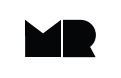
The design below has been developed along the same concept as the previous identity, however now using just 1 colour.
I chose a more friendly and in some ways, expensive typeface - which i think represents me more a designer than the previous identity. Originally i wanted to keep 'Graphic Desogn' very minimal using a small point size, however upon developing the design i found i did not like the positions i experimented with in the layouts below.
Further development needed for the 'Graphic Design' text of the design, however the initials are looking exactly as i had invisioned when starting the design.

In my previous identity I used 2 colours which I never really felt confident about. I used black for the whole logo plus red for the 'R' initial. But i felt this, and the selected typeface cheapened the design as a whole.
The design below has been developed along the same concept as the previous identity, however now using just 1 colour.
I chose a more friendly and in some ways, expensive typeface - which i think represents me more a designer than the previous identity. Originally i wanted to keep 'Graphic Desogn' very minimal using a small point size, however upon developing the design i found i did not like the positions i experimented with in the layouts below.
Further development needed for the 'Graphic Design' text of the design, however the initials are looking exactly as i had invisioned when starting the design.

Thursday, 20 January 2011
Portfolio (First Draft)
In preperation for the visting professionals, I have prepared a draft portfolio. When I was building the portfolio and reviewing previous work, I found that a lot of the work I had produced, I was not actually comfortable with putting into my portfolio.
I managed to narrow my work down to six briefs that I felt reflected my design direction and worked alongside my personal statement.
Although in the previous module i produced 5 seperate identities along with stationary sets, i have only included 2 of these briefs as i do not want to exhaust the idea of being a designer purely for branding.
Producing this portfolio really is like putting down the foundations of whats to come. At thus stage i'm happy enough to recieve criticism from the visiting professionals as to what needs doing.


Although this is my first attempt at a portfolio, i feel it is a good starting point. Some of the work im not 100% confident with, however at this stage i know i have time to replace and re-organise the portfolio as needed.
Wednesday, 19 January 2011
Final Business Cards (for now)
Finally i gave in, to using my initials as my identity as a designer. I have always been funny about this, as they simply spell 'Mr'. I wanted to keep the design simple, yet add another concept to the identity which would change overtime with each business card.
I duplex printed this resolution in the digital dungeon, and James taught me a lesson on linement. The stock is mount board, bought straight from the library for £1.40 and printed for a further 50p. So in total, these tempory business cards cost me under £2, yet have the feel of a quality business card.

I duplex printed this resolution in the digital dungeon, and James taught me a lesson on linement. The stock is mount board, bought straight from the library for £1.40 and printed for a further 50p. So in total, these tempory business cards cost me under £2, yet have the feel of a quality business card.

Monday, 17 January 2011
Re-Brand (Revised Logo and Business Card)
After getting my first set of business cards printed, i more or less immediately disliked them. I didn't like the logo design, i felt the colours of the logo clashed with the reverse side pattern.
I went straight back to the drawing board, and decided to once again go back to using my initials apposed to my full name. I have always considered my initials to be a nightmare, initials which i couldn't experiment with like how i wish i could. However after doodling on my page for a good 2 or 3 hours, its finally came to be - how i could use my initials to the full potential.
Below are four different logos. However each one will be used. Each business card will be printed with the same details on the reverse side, while the front will change each time, identifying what and who i am as a designer.


Business Cards - First Prints
These are the first print-outs which we produced on monday morning. After spending 2 days attempting some sort of re-brand, in the end, i'm just not happy with this resolution.
The prints however, did turn out nicely. The colours achieved from the printers in the digital dungeon really lift the pieces.
Although i did spend time committed on this design until the early hours, in the end i dont feel this design represents me as a designer.
So back to the drawing board, again.


Re-Brand (Business Cards: First Print-outs)
Below are a couple of images which show the first print-outs. The lads were pleased with how their business cards came out, each of us decided to use a pattern or a solid colour on the reverse side of our business cards.
At first i was pleased with the resolutions, however after cutting them out and getting to see the type first hand, the details at the bottom of the business cards were not legiable. The tone of the type was too thick and the ink bled through the stock which wasn't the best finish for a business card, which i intended to give to several of the visiting professionals.


At first i was pleased with the resolutions, however after cutting them out and getting to see the type first hand, the details at the bottom of the business cards were not legiable. The tone of the type was too thick and the ink bled through the stock which wasn't the best finish for a business card, which i intended to give to several of the visiting professionals.


Re-Brand (Business Card Experiments)
Because i have now produced several different identities, i decided it would be good to experiment with the layout and potential of the logos. I have taken two of the identities, which were my particular favorites (so far). Below, i have experimented with the placement of the logo, and then centred the personal details at the bottom of the business card.
The designs immediately below, using the 'Marc' logo in the circular frame, will be getting printed tomorrow. As a part of the 'bammm' team, four of us have decided too print a series of business cards early this week, which will be produced in time for the visiting professionals later in the week.


The above designs are not my favorite of the bunch. I wasn't too fond of the logo which i have used in the design, however i thought using the rite colour pallet, i could make it work. The business cards layout does not work, the details do not read properly and legiability is an issue.
Marc Redhead - Self Promo
This is the start of the self promo. Jam & Toast is no more (at the minute) and Marc Redhead the designer is getting an identity. For the start of the design process, i decided not to restrict myself, so i have no limitations in terms of using my full name or just my initials.
Because i'm a type based designer - and illustrated logo was immediately out of the question. I wanted to find a typeface which was sharp and eye-catching.
My initial ideas (at the bottom of this post) were safe concepts. I was working them on the basis of the space around the letterform. I wanted to create a logo which shows letterforms which don't actually exist. However this concept got tedious and before long i had exhausted the idea.
I then moved on and started using solid fonts. At this stage i also experimented with using my full name apposed to just my initials. I got influence for several of the designs from one of 'Lily Allens' album artworks, however it was not complimenting my design direction, so once again it was time to move on.
I tend to lean towards sans-serif typefaces in my work - and i feel my own identity shouldn't be any different. I once again returned to using my initials apposed to my full name. I much prefer this and it allows me to be more experimental with the layout. Placing these designs in a circle at first was a nice direction to take the design, however after a sit down and a chat with a fellow designer, we both agreed its done too much and that it wasn't going to work.


Re-Brand (Type Selection)
The first stage of this re-brand process is too choose a typeface to work with, or several to develop from. I want to use a sans-serif font, because the majority of my work is type based. Most of the final resolutions from identities to advertising, i tend to use sans-serif fonts.
Below are several fonts which maybe used in my final resolution. I had chosen a range, which are all different in their own way. I would prefer to work with a heavier font, however it depends what works and what doesn't when it comes to development and initial ideas.
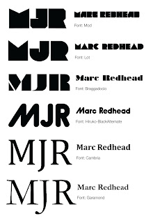
Below are several fonts which maybe used in my final resolution. I had chosen a range, which are all different in their own way. I would prefer to work with a heavier font, however it depends what works and what doesn't when it comes to development and initial ideas.

Revamp of Jam & Toast
After the recent briefings and workshops, which have been constructed towards self-promotion and possible work placements and/or internships. Because of this I had to have a serious think. Should I keep myself under the title of Jam & Toast - or should i spend some time re-branding myself before its too late.
Jam & Toast has to go, I really need to self promote instead of promote a potential brand/company of my own in the future. Marc Redhead sells better as a designer than Jam & Toast.
Time too begin, I have made no restrictions to the identity. Here is a short list of what I need to consider:
Jam & Toast has to go, I really need to self promote instead of promote a potential brand/company of my own in the future. Marc Redhead sells better as a designer than Jam & Toast.
Time too begin, I have made no restrictions to the identity. Here is a short list of what I need to consider:
- Format for business cards
- Colour pallet
- Legiability
- Readability
Subscribe to:
Comments (Atom)