Monday 18 October 2010

Jam & Toast: Webpage

So here it is. The final series of pages for my website. As i sai in the previous blog post - i wanted to keep the design simplistic and minimal. I feel i have acheived this while keeping a very tidy design format. The sites colour pallet consists of just one colour, black. I have used tones of black (grey) for some of the other bits of text - i feel this works well apposed to using a random vibrant colour which will take the viewers attention from the work.


Im really looking forward to building this site. Work will start in this afternoons workshop.

Web Page

This year i decided to take full advantage of taking the web design workshop. I have always had an interest in web design however never fully understood the fundamentals and the language behind it. After last weeks first session we were asked to go and produce 1 or 2 web pages in illustrator or photoshop which we could work with in the next session.
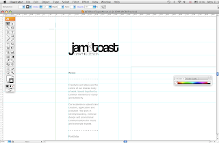
I went away and produced each page I would like on my website (excluding imagery) here they are. The images below show the development of the build.
I have kept most of the rulers on the pages to show how i worked my layouts, including the type and logo. My site will have 3 sections - I wanted to keep it as minimal as possible. There will be:

  • Home Page
  • About
  • Portfolio (which opens up further)
  • Contact
Keeping the site minimal was not going to be too much of a problem - however the colour pallet did annoy me a bit. Originally i wanted to work with a black background, however i later found that when imagery is placed on black they sometimes get lost or are not complimented.


As i said above. I wanted to keep the design minimal. Where the type is concerned i tried not to use any colours which would distract the viewer from the work - however i have made it minimal and easy to follow and use. Im pleased with the design - now to put it out there.

Tuesday 5 October 2010

T-Shirts (Upcoming inspiration)

I decided to include some examples of the style of work i hope to produce this year. I want my work to relate to music a lot more than it does now. I feel i finished last year at a good point where i can carry on with this design.
When producing another range of shirts this year - I will be using different colour canvas's and higher quality t-shirts apposed to primark shit.


T-Shirts (Last module)

Last years final module has been my best yet. The reason for this post is to remind viewers what I produced and the direction I wish to continue in. I really enjoy the process of screen printing and will be returning to the print rooms to produce a clothing range and series of posters and publications over the coming year.
This time around I hope to include some of my illustration work into my designs - however I dare say the majority of the designs will be type based.


Poster research

These posters from Tumbler are brilliant. Combining typography with layout in a simple format has worked very well for this series of posters. By using a limited colour pallet the peices are kept simple without complicating the design. I looked at these designs as they relate to one of my briefs which is to produce 10 screen printed posters - typographic or image based on my travels around the world. Looking at pieces like this inspires me in terms of layout, fonts, colour pallet etc.