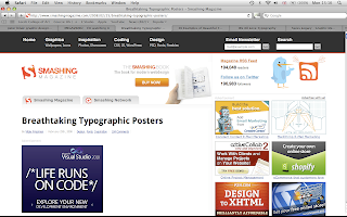
Growing more of an interest into typography. I decided to search into typographical posters which have been designed by professionals directed to different markets and audiences.
I love the design below because it is fairly unique in terms of layout and style. The colour pallet is minimal with a slight tint to the background which work nicely.


As mentioned above the range works well and covers several different techniques of design. There are some hand rendered fonts and some more traditional fonts which are common throughout design. Colours pallets once again cover the range from vibrant to lower tones but all designs are fairly limited with only 2 or 3 colours per design.

No comments:
Post a Comment