Monday 31 May 2010

MOD Media

MOD Media is another Australian based design agency which specialises in web design. The website reminds me of a blog layout. Very simple to understand - flows and reads well. The colour pallet used on the site is eye-catching, however some of the pages are a bit boring aesthetically.


Below: Examples of web-pages produced by MOD media. The examples are very interesting and unique. The clients seem to be reasonably successful brands who rely upon the website to attract clients.


Coroflot

Coroflot is a website dedicated to helping young designers put their portfolios on the web for the world too see. I regulary visit this site and get a lot of inspiration from work i see. Below are several examples of work i found on Coroflot that i felt i should show.


Below: Some work which i found on the Coroflot website. I found the designs below very interesting and to the same sort of style i like to work. The layout of type and image on these designs are very organic and interesting.

Thursday 27 May 2010

Inspiredology

Inspiredology is website i recently found while randomly searching through google. The work is mainly typographically directed. I really like the work which uses traditional fonts and occasionally hand rendered type. The colour pallets are vibrant and eye-catching while the style covers a range of different medias.


The piece above is my personal favorite. Using a sans-serif font and visually engaging colours - the designs use of scale for the type makes it a visual nightmare in terms of legibility however very nice aesthetically.

Monday 24 May 2010

Tutor Art

Tutor art is another recent find. With having thoughts of creating a new identity which could develop both in terms of design and as i age with my looks. Hard to explain but i know what i mean. I plan on creating a design like these examples below to be my new logo/identity. I plan to add my own style to the design however and possibly experiment in with colour for my pallet.


The design below is my personal favorite and more the style i wish to go for. I portrait facial shot with detail - however not as much as the other two designs above.

Friday 21 May 2010

Smashing Magazine

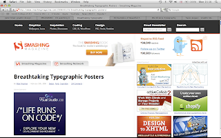
Growing more of an interest into typography. I decided to search into typographical posters which have been designed by professionals directed to different markets and audiences.
I love the design below because it is fairly unique in terms of layout and style. The colour pallet is minimal with a slight tint to the background which work nicely.


As mentioned above the range works well and covers several different techniques of design. There are some hand rendered fonts and some more traditional fonts which are common throughout design. Colours pallets once again cover the range from vibrant to lower tones but all designs are fairly limited with only 2 or 3 colours per design.

Monday 17 May 2010

Brand:Nu once again deliver

Brand:Nu recently produced and identity for an upcoming art galleria.
The design below was the final outcome and i think its brilliant. The title of the gallery alone is brilliant and the hand rendered typeface works affectively alongside the final colour pallet. Beautiful bit of design.

Friday 7 May 2010

LOL

Designer war ... this is brilliant. So Audi think they can take BMW in terms of vehicle and advertisement design. They are much wrong. This war between the two rival german manufactures has been going a long while - and i think BMW just took the line with this amazing comeback.

Tuesday 4 May 2010

Type Workshop (Development)

Over the past several weeks in our type workshop with Graham, we have been building up a portfolio which consists of a business card, letter head and compliments slip. Told to look into layout, scale and typefaces, we were set tasks to produce mockups.
Below are potentially some of my final resolutions.


Above - Business Card


Above - Compliment Slip


Above - Letter Head

Making these three works as a set is obvious. However producing them was tricky due to placement of the WetPaint logo, address, phone number - there was a lot to be played with.

Monday 3 May 2010

Random Research

While browsing around a few sites this morning i found these business card designs. I'm immediately impressed with the style and typography of these designs. I will be looking into this are more when i start re-branding Wetpaint.


Small unique design touches go a long way. From the stock, to the print process and actually cutting into the design - can make an eye-catching ad.
The designs above are clever with the colour choices - the slight drop in tones of a select colour with very thin stroked lines make a nice professional finish.